Pxless is a contemporary design strategy that substitutes fixed pixel metrics with scalable, relative ones, enabling digital interfaces to scale dynamically to all screens, devices, and user environments.
With foldable phones, AR headsets, wearables, and smart televisions taking up the bulk of the 2026 digital space, the concept of pxless design has moved beyond a conceptual pipeline and has become a necessity.
You might be a web designer, front-end developer, or product manager, but you should have an idea of what is necessary to create fast, accessible, and future-proof digital experiences: pxless.
What Is Pxless Design?
Pxless design refers to the design of digital interfaces where fixed pixels (px) are not the unit of measure. Rather, it maintains relative units, which automatically increase and decrease depending on the screen environment, user preferences, and even the content.
The most widespread relative units in a pxless system are:
- rem — units that are proportional to the root font size
- em — scales itself to the font size of the parent element
- % — scales the sizes of elements based on their container
- vw / vh — size modifiers that depend on the width or height of the viewport
- clamp — sets a minimum, preferred, and maximum size within a single rule
These units are used together with contemporary CSS technologies such as Flexbox, CSS Grid, and Container Queries to design layouts that are responsive to their context, not to set breakpoints that they were previously built around.
Simply put: Pxless does not eliminate visual accuracy. It substitutes hard precision with smart precision.
Why Pxless Matters in 2026
The web used to be simple. Designers designed to fit desktop monitors of foreseeable sizes. Fixed pixels worked fine.
That world does not exist anymore. In 2026, users can access digital content on:
- Phones with incredibly different pixels per inch
- Foldable devices with dynamic aspect ratios
- Ultra-wide displays and 4K monitors
- VR headsets, AR glasses, and smartwatches
- Smart TVs and IoT dashboards
Under this diversity, fixed-pixel layouts fail. Text becomes unreadable. Buttons are not tappable. Layouts overlap or collapse. The user experience suffers, and so does your SEO.
Pxless solves this by creating interfaces that feel natural to each situation, without requiring a different version of the interface for each device.
Pxless vs. Pixel-Perfect Design: A Clear Comparison
| Feature | Pixel-Perfect Design | Pxless Design |
| Unit type | Fixed (px) | Relative (rem, %, vw) |
| Device adaptability | Limited | High |
| Accessibility support | Often breaks on zoom | Scales naturally |
| Maintenance effort | High (multiple breakpoints) | Low (one fluid system) |
| Performance | Heavier CSS overhead | Leaner, faster code |
| Future-proofing | Requires constant updates | Adapts to new devices |
| SEO impact | Potential mobile penalties | Mobile-friendly by default |
Fundamentals of Pxless Design
1. Relative Units Over Predetermined Values
The principle behind pxless is straightforward: always use a relative unit where you would otherwise use a pixel value. Set typography has been developed to expand as users increase their base font size in accessibility options. Layouts created using percentages stretch and contract without issues as screens vary.
2. Thinking in Content-First Layouts
Pxless design inverts the design process. You do not ask how wide the screen is, but rather how much space this content requires.
This content-out approach ensures that:
- Text always has enough room to breathe
- Images scale proportionally without distortion
- Elements do not spill over or overlap
3. Fluid Typography with clamp()
Fluid typography is one of the biggest wins in pxless. CSS clamp() allows you to assign a text size that varies smoothly between two values:
font-size: clamp(1rem, 2.5vw, 1.75rem);
This single line substitutes multiple media query overrides. The text remains legible on a tiny phone and a massive screen, automatically.
4. Component-Level Responsiveness with Container Queries
Conventional responsive design responds to the viewport size. Container queries enable components to respond to the dimensions of their own container, which is far more powerful and modular.
A card element, for example, can appear in a compact sidebar layout and transform into a rich layout when placed in a wide content area, using the same HTML and CSS.
5. Accessibility as a Design Principle
Pxless design is compatible with WCAG accessibility standards. Since layouts are built from scalable units:
- Users who zoom in do not experience broken layouts
- Large font preferences are not overridden, but honored
- Spacing and touch points are proportional
Accessibility stops being an afterthought and becomes a default structure.
Practical Pxless Implementation: Where to Begin
There is no need to rewrite everything at once with pxless. A good way to prioritize it is as follows:
Step 1 — Audit your existing units. Find the hardcoded px values in your codebase, particularly in typography and spacing. These are the first priority replacements.
Step 2 — Establish a rem base. Set a base font size (usually 16px on the HTML element) and change all typography to rem values. This single change makes things instantly more accessible.
Step 3 — Change layout widths to percentages. Change fixed-width containers to percentage-based or max-width with percentages. Use CSS Grid with fr units for column-based layouts.
Step 4 — Add fluid typography using clamp(). Identify the sizes of your headings and body text, and use clamp() rules to scale them smoothly.
Step 5 — Introduce container queries. Begin using container queries on your most reused components, such as cards, navigation blocks, and sidebars. This is where pxless design truly shows its strength.
Pxless Design Tools and Frameworks in 2026
| Tool | How It Supports Pxless |
| Tailwind CSS | Classes based on rem and fluid breakpoints |
| CSS Grid + Flexbox | Native fluid layout systems |
| Figma (Auto Layout) | Automatically resizing design elements |
| Utopia.fyi | Fluid type and space scale generator |
| PostCSS | Automates build pipelines to convert px to rem |
| Storybook | Tests components at various container sizes |
Pxless and SEO: The Underrated Performance Advantage
Most designers consider pxless as a UX improvement. It is also an SEO benefit, which is important for 2026 rankings.
Here is why:
- Core Web Vitals reward layout stability. Pxless minimizes Cumulative Layout Shift (CLS) since elements scale proportionally, not abruptly.
- Mobile-First Indexing means Google judges your mobile design first. Pxless is mobile-friendly by nature.
- Pages load faster because pxless uses leaner CSS without redundant media query overrides or duplicate asset versions.
- Higher accessibility levels are linked to lower bounce rates and longer dwell times, which are favorable ranking factors.
A pxless site does not simply look better. It performs better where it matters.
Read more: UK Braced for Significant Snowstorm Bringing Potential White Christmas: Full 2025–2026 Winter Guide
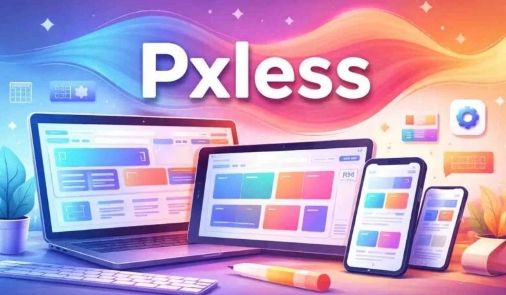
Pxless Across Digital Platforms
Web Design
The future of responsive websites in 2026 relies on pxless, built on fluid layouts, scalable grids, and clamp()-based typography.
Mobile Apps
Relative sizing greatly reduces fragmentation and testing overhead across hundreds of Android device profiles and a variety of iPhone screen ratios.
AR / VR Interfaces
In spatial computing environments, there is no fixed screen. Pxless thinking, which establishes relationships and proportions rather than specific sizes, is the only design approach that suits a 3D environment.
Design Systems
In large teams, pxless is implemented with design tokens, named values such as –spacing-md or –font-size-body, stored as relative units. This results in a consistent and scalable vocabulary across product suites.
Common Pxless Misconceptions
“Pxless means zero pixels at all times.” False. Pixels have not gone away entirely. Borders, decorative separators, and shadows still use them. Pxless means being less dependent on them for layout and typography.
“Pxless reduces design control.” The opposite is true. With clamp() and container queries, you can control how elements behave under a broader set of conditions more precisely than before.
“It is only for new projects.” Pxless can be implemented gradually. Start with typography, then spacing, then layout. A slow migration of any existing codebase is completely feasible.
Conclusions and Reflections
The difference in maintainability becomes immediately evident after working with pxless principles across web and app projects. The moment you stop writing five media query blocks to do what a single clamp() rule handles automatically, there is no going back.
Container queries are the real breakthrough. When components respond to their own container rather than just the viewport, you have a truly modular design system. You stop patching and start building systems that support themselves.
Pxless is not a sophisticated tool for experts in 2026. It is the minimum requirement for any digital interface that needs to be reliable and compatible across the devices that people actually use.
Frequently Asked Questions
What does pxless mean in web design?
Pxless is the concept of creating digital interfaces without fixed pixel (px) units. It works with relative measures such as rem, em, percentages, and vw to develop layouts that auto-scale across screens and devices.
Are pxless and responsive designs identical?
They are related but different. Responsive design applies breakpoints to alternate between layouts at predefined screen widths. Pxless design makes layouts and typography fluid across breakpoints so that no sharp transitions occur at all.
What CSS units does pxless design use?
The most commonly used units are rem (root em), em, percentage, vw/vh (viewport width/height), and the clamp() function for fluid scaling between a minimum and maximum.
Does pxless improve website SEO?
Yes. Pxless design improves Core Web Vitals metrics (particularly CLS), supports mobile-first ranking, reduces page weight through cleaner CSS, and increases accessibility, all of which positively impact search results.
How do I start converting my website to pxless?
Start with hardcoded spacing and typography values. Replace font sizes with rem values, layout widths with percentages, and heading sizes with clamp(). Then progressively add container queries to your main UI components.
What tools are used in pxless design?
The most useful tools for pxless workflows in 2026 are Tailwind CSS, Figma Auto Layout, Utopia.fyi for fluid type scales, and PostCSS for px-to-rem conversion.
Does pxless work for large enterprise design systems?
Absolutely. The current standard for large-scale design systems is to use design tokens with relative units. Pxless design reduces repetition, eases design and engineering handoff, and brings consistency across complex product ecosystems.